Our sign for quality and reliability
No matter how, no matter where and no matter when: As soon as we communicate, the respective medium carries our new logo.
Figurative and word mark
The logo comprises a figurative mark and a word mark, typically appears in this
combination and can be used in the cyan and white (negative) colour variants presented here.
We use the black-and-white version of the logo when the colour variant cannot be used for technical printing reasons.
FIGURATIVE MARK
The plain figurative mark can also be used for product labelling or as a favicon.
Oventrop logo
Colour space RGB for digital applications – protective space
Oventrop logo for professional use
In order to guarantee a company-wide consistency of the logo, it is important that you always use the unchanged original data. It is not allowed to change the logo or use it outside the cases explained here. You should also avoid using the pure word mark.
The logo is created in the colour spaces RGB for digital applications and CMYK for printing and can be downloaded here.
COMPANY LOGO WITH ADDED WORDING
For business divisions or specialist departments, the company logo can be supplemented by a word addition.
The word addition is always directly linked to the logo and its height depends on it. The cap height of the word addition is 80% of the x-height of the word mark. Vertically, the word addition begins half a line width of the "o" offset to the right.
The word addition always has the same colour as the company logo and is set in the Azo Sans 2 Light.
Clear zone
80% of the logo height determines the protection zone. You may not place any elements within this zone.
In special cases, such as on football banners or logo carpets, the protection zone can be reduced. However, a good visibility of the logo should always be guaranteed.
Size table
Claim and attachment
In certain cases, a claim can be attached to the company logo. You can find the details in our Brand Language Guidelines.
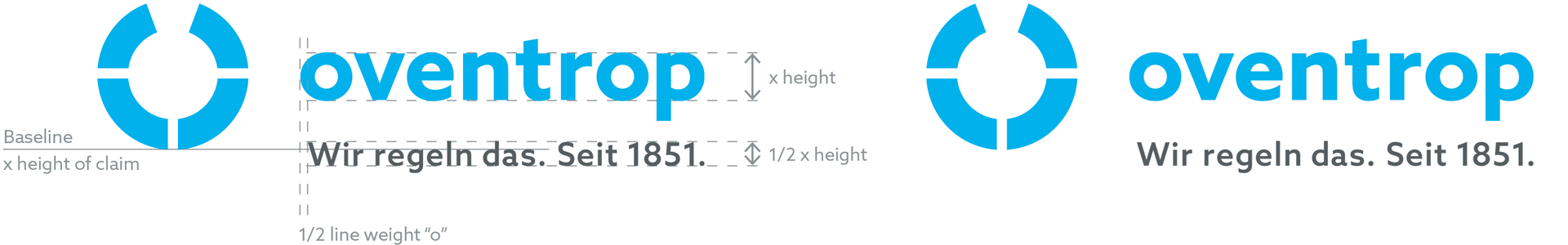
The size of the claim depends on the height of the word mark. 1/2 times the x-height of the word mark corresponds to the height of the cap of the claim. This is set in the Azo Sans 2 Medium.
Attachement to the logo
The claim is horizontally aligned with the base line of the figurative mark - this forms the x-line for the claim. Vertically, the claim starts half a line width of the "o" offset to the right.
The protected zone of the logo is simply maintained. Locate the logo together with the claim and the surrounding protection zone in the format. The claim does not always have to be attached to the company logo - you can also locate it separately from the logo.
 Claim attached
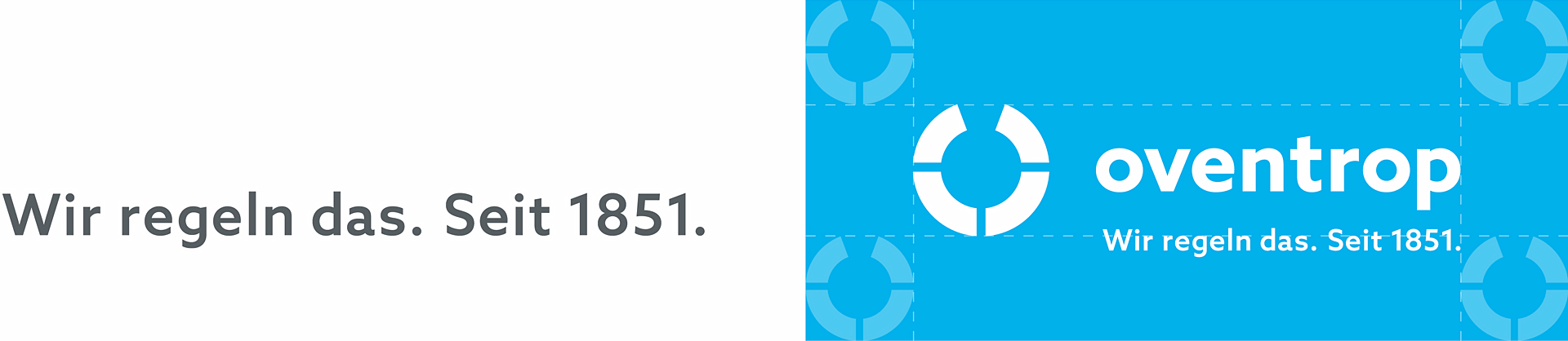 Claim detached
Format positioning
In general, you can place the logo in all four corners of the format, observing the defined minimum distance of the protective zone.
The protective zone of the logo also defines the type area as well as the grid for texts and images that do not bleed off the edge. Find out more in the chapter Layout principle.
Wherever possible, place the logo on the white space in the layout.
The white version of the logo may also be used on images covering the entire space. Please always make sure the logo is clearly visible in a non-cluttered space.
Use on image and colour backgrounds
If the company logo is placed on an image or colour background, it can generally be used in the colour variants cyan and white (negative). Please consider which colour variants of the logo may be used depending on the brightness of the background.
In the case of very bright backgrounds up to max. 20%, the cyan logo is used since the white variant does not offer sufficient contrast. For backgrounds between 21% and 79%, the white logo is used. For dark backgrounds of at least 80%, both colour variants of the logo may be used.
In order to ensure brand recognition when using the white logo, a colour quantity of approx. 15% cyan should be used in the design – e.g. by using the Super Sign.
Replace the old logo with the new one
First please check the size table above. If you don't find a match, apply the following rule: the width of the old logo meets the width of the word mark of the new logo including the distance to the figurative mark. The bottom of the word mark of the new logo sits on the same line as the bottom of the old logo. If there is not enough space, the minimum size of the new logo is the width of the old logo.
Files
The logo is available in different types of files for various applications.
| Application |
Print |
Screen / Office |
| Color space |
CMYK |
RGB |
| File type (most common types) |
EPS, PDF |
JPG, PNG, SVG |
DON'TS
The correct usage of the logo is very important for brand recognition and the effect of the medium. Below you'll find some examples for incorrect applications: