Our new brand positioning is a milestone for us! The Oventrop brand will continue to develop along the lines of our guiding principle "Intelligent Modularity" - holistic and sector-defining, increasingly international, but always personal.
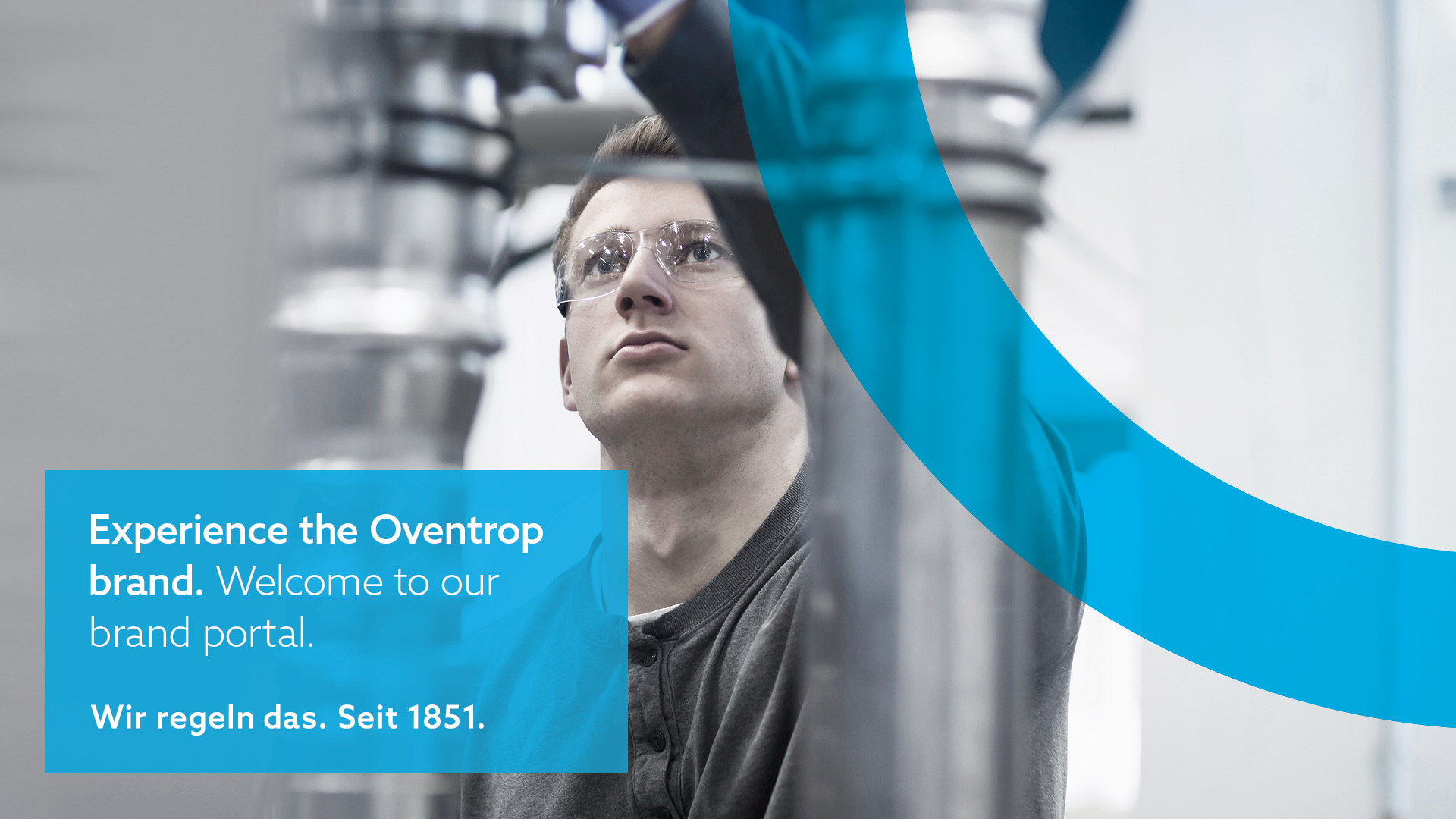
Not only our products and systems are modular. We live modularity - right up to experiencing our brand itself. This is why we have created a modular kit with the various components of our corporate design and brand identity. Whether logo, flyer, Power Point template or trade fair material, whether an insight into our world of images and colours, information for print media or principles for digital media - here you can quickly and easily find every Oventrop brand module you need for your work or project.
Our brand presence determines our identity. We ask you to follow the guidelines in the brand portal - and hope that they will inspire you to work with and on the Oventrop brand. If you have any questions, we are always here for you. Together we will handle it!
Enjoy discovering!
Basic elements of the Oventrop design: Logo, claim, icons, colour and picture worlds, ...
find out more...
Layout templates for the design of brochures, advertisements and posters.
find out more...
Design business cards, letterheads, presentations and other documents CD-compliant.
find out more…